I kid you not. You can learn photography lessons in a lot of different places. A great lesson in lighting is to watch the movie Citizen Kane. Turn off the sound and study the use of light and shadow.
It may seem like big jump from Citizen Kane to the Sports Illustrated Swimsuit Issue (and it is), but they both teach valuable lessons.
You will need to go out and buy the Swimsuit Issue. Then go to this online article [this link no longer works] at the New York Institute of Photography (NYIP) web site. Read the online article and check out references to the pages in the SI swimsuit issue. You will learn lessons in technique, lighting, focus, and detail. Seriously.
The NYIP web site [this link no longer works] is worth checking out on a regular basis for the free, ongoing photo lessons they provide.
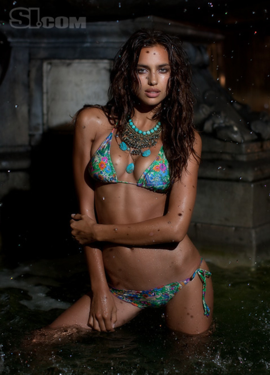
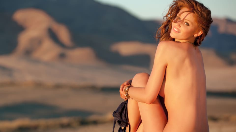
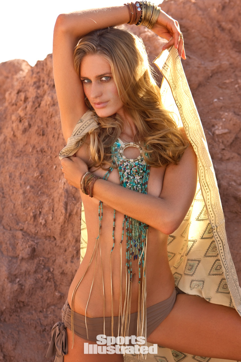
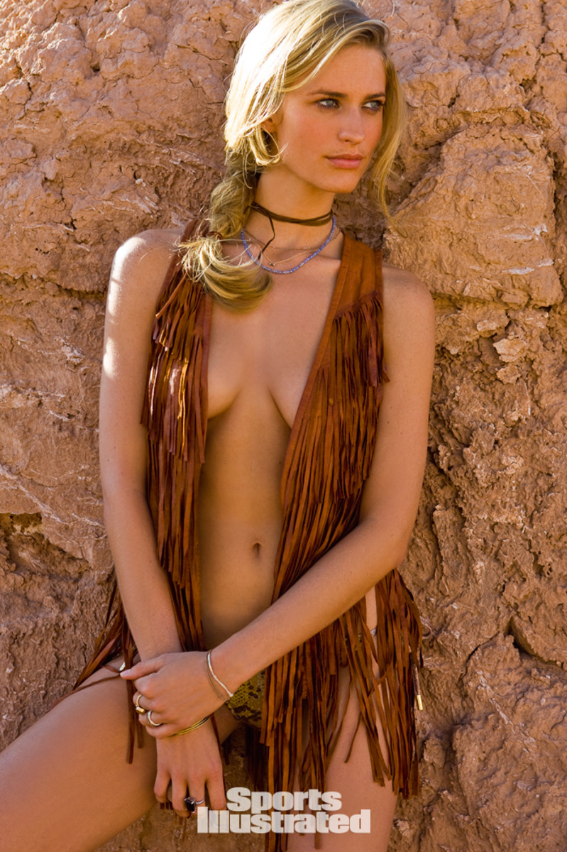
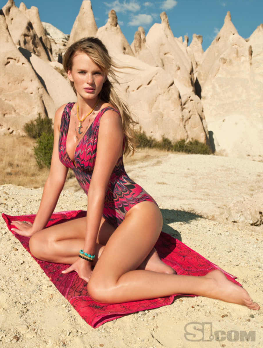
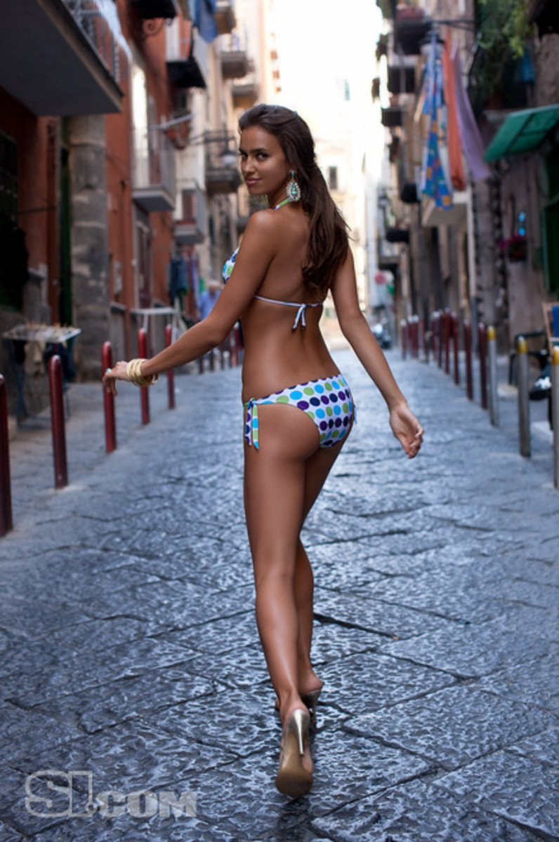
Update, February 7, 2024: NYIP no longer owns the NYIP.com domain name so the links no longer work. This NYIP article is no longer online. The 2009 swimsuit issue is not readily available and I don’t know which photos are referred to in this photo lesson, so I looked for images of SI models that match the topics.
What can you learn about photography from the Sports Illustrated Swimsuit Edition? A conversation with four NYIP Instructors: Chris Corradino, Dominique Doktor, Tom Cavalieri, and Beth Green.
Editor’s Note: Every year SI’s Swimsuit Edition jumps off the shelves, bringing a little bit of warmth to post-Super Bowl February. But it’s not just adolescent boys and lonely old men who closely peruse the magazine’s pages. In fact many photographers, from pros to amateurs can learn a thing or two from taking a closer look at this annual release.
Before we turn to our staff members’ comments, a few things are worth noting. In these challenging times, even the Swimsuit Edition is feeling the pinch as the 2009 Edition contains 203 advertising pages, down from 285 last year. Early stats show the online traffic has tripled however. As one publisher put it, SI should do everything possible to put “buzz” around this year’s issue because “everyone and his brother has a swimsuit edition these days.” In addition to the cover photo debut on the David Letterman Show, there was a big Las Vegas promotion in kickoff week.
The Swimsuit Edition is not without its critics, and sometimes it does take itself too seriously. For example, the body painting segment may have run its course. The basic premise of “she’s naked, but no matter how hard you look you’re not going to see anything,” is a little strained. The paint job on pages 116-117 is almost scary.
To follow our staff members’ comments, you’ll have to shell out $6.99 for the magazine because we refer to the subjects by the page numbers in the printed magazine. You can always go to the library if the recent economic situation has you pinching pennies.
Lastly, a tip of the hat to photographer and writer Charlotte Lowrie, who wrote a photo analysis of the SI Swimsuit Edition some years back when MSN had a photo section that she tended.
Technique
Tom: Every year it’s the same thing. Beautiful women, and exotic locations. How hard can it be to get a great shot? Besides the obvious, what are the photographers doing on these shoots that make them especially good?
Chris: By studying these images from a photographic perspective, one can get a basic understanding of what went into making them. For example, notice how almost every image was taken with a wide aperture. Also, in some of my favorite shots, the photographer intentionally dropped the background exposure by a stop or two, and lit the subject with flash, possibly utilizing a gold warming reflector to add a bit of warmth to the skin tones (see page 52). In addition, a fast shutter speed was used to freeze the motion and ensure that both the model and the apparel are tack sharp.
Dominique: You can really study the photographer’s technique in any magazine. Being perceptive and learning to train yourself to observe light in any advertisement, spread, or real-life situation is an art that will be useful to you as a photographer forever. Pay attention to details: the direction of the light, the harshness of the light, the focal range, the difference in stops between the foreground and background. These are all elements that create the mood of a photograph.
For example, on pages 76-77, notice the subject is backlit. The hair light and glow on her forearm and back of her thigh show the harsh light of a mid-late afternoon sun. The subject herself is in the shade, which can be achieved naturally, or by someone blocking the sunlight with a black reflector. If the subject is shaded naturally, then the photographer most likely used a reflector for a fill light. The lighting and environment in this photograph show a beautiful contrast of harsh and soft, the rubble and the smooth skinned young woman, and the harsh sun ever so slightly touching the soft shaded subject.
Beth: With portraiture, the eyes are the real subject. In nearly every image, the photographer has done a wonderful job of placing the eyes into the rule of thirds. Pages 58-59 show a particularly stunning example of this. More importantly however, is the trust the photographer has built with the models. Look at pages 54 and 55. Notice how the model is almost doing a sit up. She is rising up to the occasion, lifting her head towards the sun, and looking right into the camera. It takes a special photographer to connect with a subject in a way that can reveal their subjects heart and soul.
Light
Chris: First, notice the beautiful control of the lighting. Some are taken during the magic hour like the shots on pages 13, and 92-93. By utilizing the low angle of the sun, the resulting images feature warm saturated tones.
Tom: When isn’t it magic hour on a tropical island, surrounded by bikini-clad models? What if I’m not in such an ideal setting to begin with?
Dominique: We don’t all have the privilege to get paid lots of money to travel to exotic locations, stay in expensive resorts, and photograph beautiful, practically nude models with lots of gloriously expensive photo equipment. Learn to use what you have. A photograph of your eccentric pack-rat neighbor in her crowded Brooklyn apartment, with natural window light and your home-made reflector, could be just as beautiful as the million dollar photos found in SI’s Swimsuit Edition.
Chris: While it is true that these photographers landed a great gig, they got here for a reason. They aren’t simply leaving the camera on auto and firing away. There is a good amount of technical control that is being exercised here. The people behind the lens are professionals who could likely handle just about any assignment that came their way.
Tom: Another thing that comes to mind for me is: I wonder what the rejected images look like? Even with all the perfect ingredients, light, subject, location, equipment, etc., even pros have to take lots of shots to get that one exceptional capture.
Beth: Again, these images go beyond the angle of light, or whether or not a reflector was used. Sure, the lighting is handled superbly, but these photographers have mastered the technical details of photography and are therefore able to focus on creating a special work of art with the model.
Focus and Detail
Tom: If starting off with naturally beautiful models and settings isn’t all it takes; what is the photographer doing to show off the subjects to their best advantage? At NYIP we talk about the three guidelines: subject, focus the viewer’s attention, and simplify. The subject in all the images is obvious. What are the photographers doing to focus the viewer’s attention on the subject – as if being beautiful and nearly naked weren’t enough?
Chris: The focus on the models eyes is consistently sharp, thereby creating a connection between model and viewer. Also, pay close attention to the model’s fingers. Hands are very expressive, and the photographers do a great job posing them. A few good examples of this technique are found on pages 44, 71, and 76-77. The photographers also use the elements very well to capture interaction between the models and landscape. Whether it’s the palm trees, ocean, or sand, you’ll notice the model is never just posed in a static way.
Tom: Somehow, as picturesque as those landscapes are, I’m never distracted by them, except once. In an article near the front of the magazine, pages 22-24, SI gave the models a chance to snap “candids” of themselves. One of the models is posed lying across a bank of washing machines. It’s an interesting picture. I liked the incongruity of the bikini-clad model in her building’s laundromat, and it actually looked more authentically candid than the others. But the washing machines are as sharply focused as is the model. I almost don’t know where to look. Ultimately it’s not as visually arresting an image as the majority of the others throughout the magazine. The photographers manage to simplify what’s going on in the rest of the picture, enhancing the feel of the picture, without overwhelming the subject.
Dominique: It is humorous to me that these photos are taken in all of these exotic locations, yet all you see of the area is a blurry shade of blue/green in the background. Needless to say, I am impressed with the choice of locations in this year’s issue.
Finally, SI brought something different to the table. Naples, Italy and Cappadocia, Turkey really blew me away with its alluring warmth, richness, and fine textures. It was nice to see a change from the average damsel frolicking in the shallow waters of some unidentifiable island.
The Naples spreads, pages 78 – 89 are truly environmental portraits. They suggest an actual place or lifestyle. Surrounded by Italian statues and colorful city streets, the Italian looking models in these images are doing everyday activities. Though I am not sure how believable it is that they are grocery shopping or riding a Vespa in a bikini, it was nice to see something different.
Cappadocia, Turkey was my favorite location by far (pages 92 – 107); filled with textures and patterns of richness and warmth. Even when the photographer uses a low Depth of Field, softening the details in the background, the eccentric and vibrant color palette gives you an idea of where in the world they may be.
Beth: Posing in the sand for long periods of time is not as comfortable as it may appear. Yet, the relationship between the models and the photographers is evident in the relaxed expressions on their faces, and the intensity in their eyes.
Advertisements
Chris: In 2009, advertising numbers were way down for both newspapers and magazines nationwide. This appears to have also affected the swimsuit issue, as there are far fewer ads in the 2009 release then in the 2005 copy we just happened to have in the office. Yet, S.I. was very wise to include video of the models on their website. Check it out for yourself. When you play many of these clips, the first thing you will see is an advertisement. This will help to offset the reduced number of printed ads. By adding multimedia content to their site, S.I. stands to reach even more viewers, including those who don’t actually buy the magazine.
Dominique: The type of advertisements in a magazine will give you an idea of the magazine’s target audience. Advertisements for booze, cars, motorcycles, and food suggest that this is a magazine geared towards men, despite the fact that the magazine itself is to showcase designer swimsuits for women.
The Arby’s add on page 85 made me laugh out loud. About half way through the magazine, in the middle of this spread of stunning photographs of beautiful women groping themselves, is an image of two hamburgers, resembling breasts, being fondled by two hands. It is clever, flipping through page after page of the women touching themselves the same way, the ad blends in; it forces the viewer to look at the burgers because you were expecting breasts. It is almost subliminal. It would be no surprise to me that without even noticing, many readers found themselves craving an Arby’s burger at some point soon after reading this magazine.
Understanding demographics and target audiences will help you as a photographer when you are ready to start marketing your business. For example, if you primarily shoot children, you want to target women, mainly mothers. You can advertise in places like a local children’s clothing or toy stores, family doctor offices, or mommy me classes. If you primarily shoot weddings, your advertisements should also be geared towards women. You can advertise in places like a local florist, dress maker, or venue.
Tom: And I guess it’s good to know that when a big edition like this one is put together, it’s not just about the featured spreads. There’s lots of ancillary work that goes along with it, like shooting the ads. Maybe I’ll get some work in the SI Swimsuit Edition yet!

